ATLASSIAN • B2B ENTERPRISE • 2025
Fixing 18% adoption on the product's competitive edge

TIMELINE
2 months
ROLE
Product Designer (Me!)
TEAM
Product Owner
Six Developers
Two QA engineers
Technical writer
TL;DR
A feature the company called its most requested and sold as its edge over competitors required typing an expression from memory into a panel three hundred pixels wide.
I replaced the typing with a three-select builder and three one-click presets, and moved configuration out of the panel into its own modal.
←
(NDA)%
Feature adoption rate
←
(NDA)%
Target-segment feature adoption rate
SOLUTION
A template rebuilds an issue tree and Smart Defaults computes its values
Issue Templates recreates a saved issue or a whole issue structure on demand. Smart Defaults computes field values the moment an issue is created from that template, so a date or an assignee never has to be typed by hand.

Three presets produce a working rule in one click
First contact needs no decision. Three cases named most often in interviews sit above the builder. The same result used to require knowing the string “now + 5d”.

A custom rule is built from three selects
Choosing instead of guessing. The first select names the field to fill. The second names where the value comes from. The third names the source field. All of this used to live in one text input with no suggestions.

The list of configured rules states what will happen
"Set due date to 5 days" – The modal shows every rule on the template as a plain sentence, each one expandable for editing. The panel used to show a counter beside the heading and nothing else.
OVERVIEW
The product led the template market and this feature carried its edge
Issue Templates served 1,342 instances across six licence tiers from two production environments, and held first place in market share among its direct competitors.
Only two of seven competing apps computed field values at all
Of more than twenty apps reviewed, two did the same thing. Repeating Issues offered Velocity expressions with a wider reach but a harder setup. The product's edge therefore sat inside a feature its customers never reached.
The product had two surfaces
The administrator configures the app inside the customer organisation and controls permissions and usage scopes. What the end user sees depends on an org structure that user cannot see, so the design covered a visibility model.

Issue Templates for Jira
DEVINITI
PROBLEM
Four separate sources pointed the same way before design started
Analytics for October 2024 showed feature usage per licence tier. A review of support tickets was the second source. An in-app survey was the third. The sales target above one thousand users was the fourth.
An audit from a year earlier had already asked the core question
The September 2023 interface audit asked why dynamic variables had to be typed by hand when they could sit under a button with a list. A year later, interviews said the same thing.

BEFORE
The section held a counter, a paragraph of explanation, one hint with one example, one select and a Validate button. Correctness was checked after the fact, by a separate click.
I named the four stretches of road to the feature blockers
Knowing the feature exists. Knowing what it can do. Being able to operate it. Technical conditions the interface never mentioned. The name carried into team conversations and set how we prioritised at the workshop.
An administrator sets the rule and somebody else sees the result
The value proposition promised benefits to four user types, while one to three people per organisation actually configured it. The person who sets a rule never watches the moment that rule fires.
INITIAL FINDINGS
Eighteen percent was a signal, so I went to interviews next
The company had a written rule that analytics observations must be confirmed with a user. The number said the feature was unused and said nothing about why.
I narrowed the study to one feature because reports were getting lost
The script from two quarters earlier ran to about eighty questions across the whole app. I proposed three warm-up questions and one task inside thirty minutes. The bottleneck sat in what the audience could absorb, so I shrank the report.
Recruitment ate twelve of the study's forty hours
The in-app survey produced four participants, support produced two, the marketing contact base produced none. The survey worked because it asked about this one feature and sat on screens the people who configure it actually open.
The brief said "raise adoption" while access was what needed fixing
None of the four blockers touched what the feature does, all four touched the road to it. Adoption turned out to be the effect, so the goal moved from adding options to removing the need to type.
Six interviews showed the threshold sits in recognising the syntax
Three participants knew the feature and used it occasionally, three had never heard of it. Nobody struggled with what the feature does. The struggle started at reaching it and at the language it speaks.
The phrase "JQL syntax" split participants into two groups
Once an administrator connected this to Jira query syntax, they carried on unaided. Anyone who missed that connection had no cue anywhere in the interface. The feature's real reach came back in one line, "end users have no idea Smart Defaults exists".
The heaviest user ran fifty rules on a single template
The panel stopped being readable past ten entries. The tool sat in very few hands, and those few pushed it to its limit.
GOALS
User goal
Set a rule without learning syntax
Business goal
Usage above one thousand users from 52% to 70%
User goal
See what the template already does
Business goal
Shorter time from install to first value
User goal
Know the entry is valid while typing it
Business goal
Fewer support tickets
User goal
Understand why a rule returns nothing
Business goal
Lower churn
DESIGN PROCESS
The workshop sorted 33 problems into four blockers and sized the fixes
The question was whether to design from the screen or first agree which stretch of road costs most. I chose the workshop, because data and interviews had already closed the diagnosis. The cost was handing part of the solution choice to a team vote.

Journey map. The densest step is adding rules, where hunting for an expression in the docs and validating only at the very end both sit.
A mapping board exposed blockers with nothing against them
I built a map with problems on one side and proposals on the other, to keep research tied to what the team came up with. An ordered task list would have been faster and would have hidden the gaps.
I scoped the work around removing the need to type
We sized proposals together in four buckets, from under three days to over two weeks. I picked the set around the most frequently named stopping point, which dropped the preview of the generated structure, the answer to "what will this actually produce".

Configuration moved from the panel into its own modal
The question was where configuration should live. The cost is pulling configuration away from the context the user opens it in.

The panel column lost variants with each pass while the modal column gained them. In the last iteration the panel is only an entry point with a counter and a button.
Three selects replaced guessing at the string
I chose a three-select builder, because the threshold sat in guessing the convention. Autocompleting syntax inside the text field would have been cheaper and kept the notation expressive, but it would have left the requirement to understand that convention.
Three presets shorten the road for first contact
I chose the three cases named most often in interviews, covering dates and assignment, so first contact needs no decision beyond a click. Presets narrow the picture of what the feature is for, and that is what they cost.
The rule list describes the outcome as a sentence
I chose plain sentences, because the list answers "what will happen" for someone who never sees their rule fire. I dropped showing the generated expression beside each rule, which would have taught one notation through the other.
"Expression" promises typing, so the modal talks about rules
The mechanism's working name had been Smart expressions, and the modal now carries a subtitle about setting automation rules for a template. The cost is moving the name closer to Jira's built-in automation, which some participants already confused it with.
Developers challenged the date entry for business-day rules
During the feasibility check, developers showed that two date entry variants behave differently for text fields. I left both in the mockup with a condition on consistent field widths and handed the call to engineering, who knew the cost on the field side better than I did.
Inline validation did not make the scope
The user story template required every requirement to carry one of three priority levels, and validation got the lowest one. A first-run guide and a migration path off the old expressions dropped out as well.

BEFORE
One syntax input, open to everyone and legible to few.

AFTER
The builder as the default path and the same syntax under the Advanced method tab. clicks to get to the payment screen and even then, the payable amount is inconsistent.
Twenty-two field types forced one reusable field view
The choice was twenty-two separate views or one where only the option set changes. I chose one, because separate views would mean that many places to maintain and that many ways the same action could look different. The cost is that unusual cases have to fit the same layout.
METRICS
Saving a working rule decides, and modal opens are the denominator
The easiest metric would be modal opens. It climbs on its own once the feature gets a visible entry point, and someone who saw the selects and left counts the same as someone with a working rule.
Four blockers produced four measurement questions
How many people reach the feature is entry views against modal opens. Whether the shortcut works is preset use against building from scratch. Where people stop is builder abandonment. Which field types are hard is saves broken down by type.
The expert-path counter settles the argument about retiring the old entry
The headline metric is the share of organisations with at least one working rule. A counter on expression use sits beside it, because without it the question about a single configuration point has no answer.
DESIGN SYSTEM
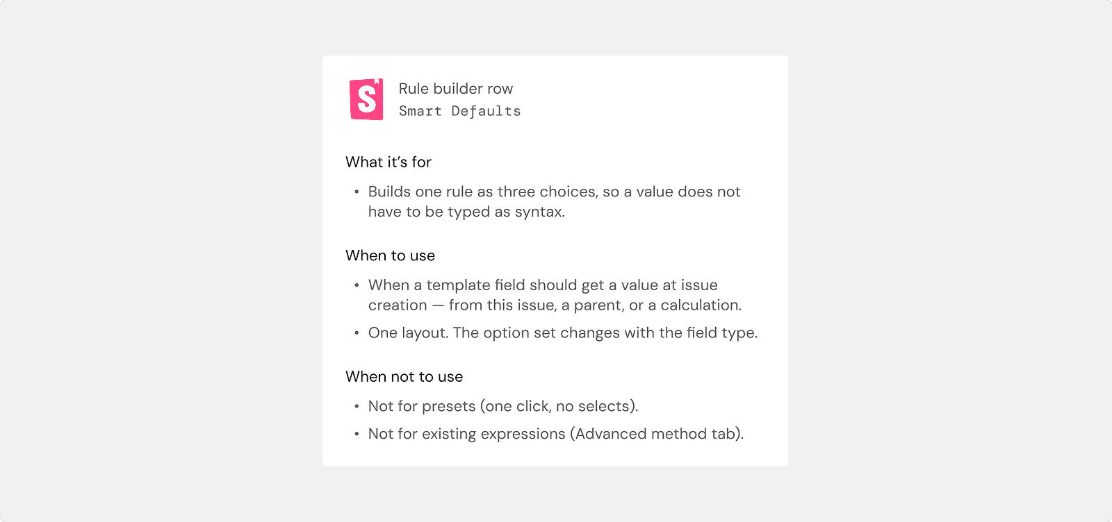
Storybook was a quality gate, so specs covered states and edge cases
Components were built in Storybook from my specifications, which covered logic, states, edge cases and interaction rules. Developers used them while building and QA while checking consistency, so decisions about behaviour did not come back for each field type.
QA & TESTING
Handover surfaced the question of old configurations in the new modal
If the old path stays, we had to decide how a rule written as an expression appears inside the new modal. I carved it out as a separate item, because it only surfaced at handover.
QA also verified that analytics events landed in the tool
Testing was its own workflow stage, covering the feature branch and the development branch. Verifying analytics events belonged to that same stage.
The technical writer received full design descriptions
Documentation used to be the only place a user could learn the feature existed and how its syntax worked. Support was at once a source of input tickets, a recruitment channel and an observed case.
The design covered the empty state, editing and dependency cases
The empty state carries its own message, and a rule row expands for editing then collapses after saving with the values swapped. Three events, the modal opening, a field being added and a configuration being saved, went into the specification handed to development.
OUTCOME
The road to a first working rule no longer leaves the product
It used to mean learning the feature exists, scrolling to the bottom of the panel, leaving for the docs to find the syntax, typing the expression and checking it with a separate button. Now it means opening the modal and clicking a preset.
The share of organisations with a working rule measures the first goal
The headline metric and three events sit in the specification handed to development. The second goal rested on purchase hypotheses marked as needing confirmation, and the third is countable by filtering on the study code.
REFLECTION
My key takeaways and learnings
I would make inline validation a must-have requirement today
A select-based builder removes typos, but not the case where a rule is syntactically valid and still returns nothing. Research described that blocker in more detail than any other.
I stand by 2 configuration methods because customers pay for working templates
Taking syntax away from people who built templates on it breaks their configurations. A simple builder as the default and syntax behind a tab serve two populations inside one interface.
I stand by replacing the input rather than autocompleting it
The cheaper route kept the notation expressive and left the threshold exactly where it was. Research showed the threshold was recognising the convention, so a hint inside the field would have treated the symptom.
The feedback loop breaks on the permission model
The administrator who sets a rule never sees the issue where it fires, and the user where it fires does not know the feature exists. In admin-configured products, simplifying configuration does not close adoption on its own, because the person configuring has no way to confirm their work landed.
LET’S TALK
Happy to walk through the decisions this write-up compresses into a paragraph each.

